 James Borrell is a biodiversity scientist and science communicator researching how people and nature can adapt to environmental change.
14 Maps Of The World That Put Conservation In Perspective
We’ve all seen that run of the mill map of the world. It’s in our everyday lives, and pervades our concept of conservation too.
You might have one of those maps on the wall and whiled away a few hours daydreaming for distant wildernesses. One of the reasons I like maps is that no matter how hard you look at them, there’s always something new to notice. You might trace the route of huge rivers that you’ve never heard of, impossible to imagine. Wondered about that big lump of land off of South Africa that you’ve never noticed? Or longed to set foot on perhaps the last proper chunk of Gondwana left adrift in the Pacific. I know I have, and I’m sure I’m not alone.
But all that can be done with our same old boring map of the world. Over the long and winding course of history, it could have quite easily ended up looking entirely different. So take a moment to indulge in some different perspectives.
Our World Map Upsidedown: Looks a bit strange doesn’t it?

How about centered on Australia: It makes you wonder why we all agreed that North is up?

Or just Upside-down Australia Map

We could look at the earth at night (I’m sure we’ve all seen this one before)

But what about the same map distorted by population…

A map of the distribution of Muslims…

A map of tectonic plate velocities…

A map distorted by the number of girls NOT at primary school

In many places we’ve barely mapped the ocean floor, but this gives an idea of what’s down there…

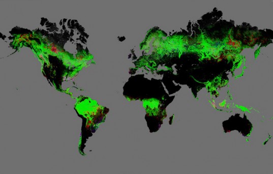
For biologists: A map of earth’s vegetation

Or for meterologists (or thrill seekers): The number of lightening strikes per square kilometer

Take a step back and think about Pangea, with modern international borders

Or which continent wins for the most exciting flags: My vote is for Africa

But maybe the best map, is google’s new high resolution map of global deforestation. This could be an amazing tool to tackle deforestation.
